I’ve been trying to figure out what I like for the All Mad Here cover for a bit. There’s a lot of general elements that I wanted to include to allude to the story inside, but getting it all together is kind of rough.
For reference, I do not draw. I haven’t put the effort and energy into getting good at this kind of art. I find low-cost and free vectors that are labeled for commercial reuse from around the internet, and then I assemble and modify as much as I can.
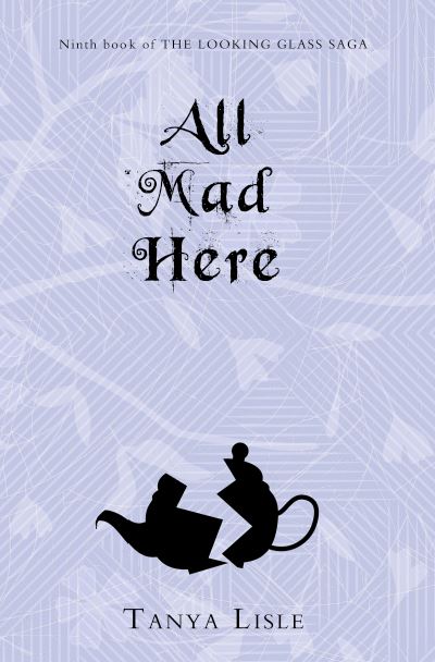
Placeholder. I knew what colours I wanted and a general idea of something broken. I haven’t leaned into the tea yet, but it might be the time, given the title. And then I walked away from it until after the rewrite.
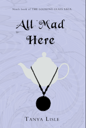
Tried to keep the tea theme, but there’s a necklace that plays a role in this story. So do I like the idea of a necklace? No. No I do not. But I do like the spiraling effect on the background.
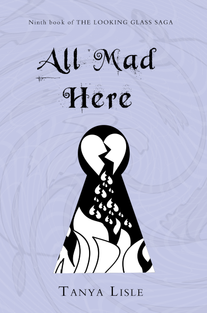
I saw some Wonderland-related art that had keyholes and I do like the idea. The peek inside something locked is a concept that works. And everything on fire and broken hearts are good for this book. Just something seems off…
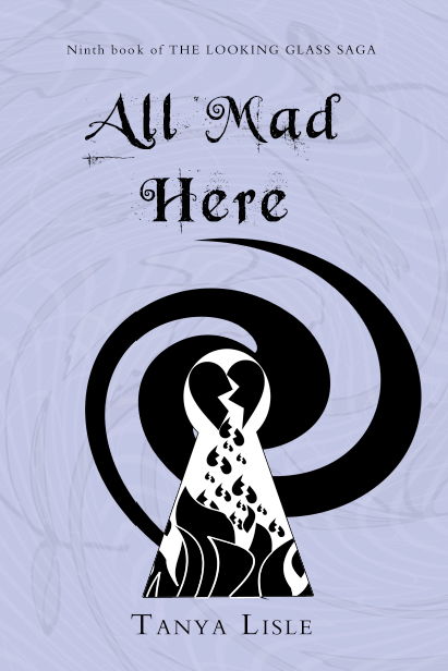
The colour is better. And the idea is starting to feel more right, with the second spiral coming out of the head of the keyhole. It looks a bit too orderly.
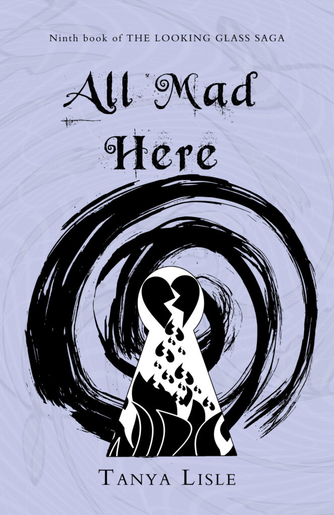
And this is where I’ve landed. The spiral feels a lot more chaotic here and I feel better about things. Yay!